Election campaign
The political story of 2014 in 14 charts: part one
To wrap up the year, I’ve looked back at some of the most significant political events of the past 12 months and picked 14 charts that sum up what I think were the most memorable trends, winners and losers.
The first seven charts appear today; I’ll post the remaining seven tomorrow.
1. One prediction Nigel Farage got wrong
The day before the European elections took place, Ukip leader Nigel Farage forecast a “record turnout” at the polls.
This would have meant more than 38.5% of UK electors casting a ballot, breaking the previous record for a turnout set at the European elections in 2004.
But this didn’t happen. Turnout did not hit record levels. It didn’t even go up.
Turnout was down – down to second-lowest level of the last 25 years:

That figure of 34.2% was even more pathetic when considering overall turnout across the whole of the European Union was 43.1%, an improvement on 2009 (though by only 0.1%).
The true “earthquake” at the 2014 EU elections was not how many people voted for Ukip, but how many people voted for nobody at all.
2. One prediction Alex Salmond got right
The former Scottish first minister’s expectation of a “record turnout” in the independence referendum came to pass. The figure of 84.6% topped the list of participation in every national or regional-based referendum in the modern political history of the UK:
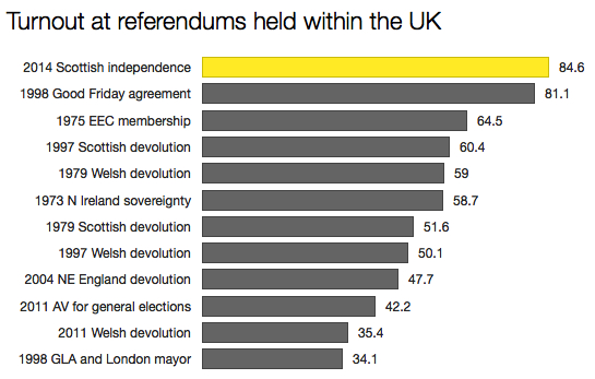
But that wasn’t all. The figure of 84.6% also topped the 83.9% record for a turnout in a UK general election, set back in 1950.
3. That Ukip local election ‘surge’ in full
A reminder of how Ukip did in May’s local elections:

I’d still choose to describe Ukip’s performance at this election as a “foray” into local government. A surge implies something consistent and considerable in its advance. This didn’t happen.
One particular aspect of the media’s coverage of the local election results didn’t help.
Contests where Ukip won councillors were largely reported without mention that only a portion of the total seats were ever up for grabs.
Hence the Rotherham “result” was often summed up as “Labour wins 11 seats, Ukip wins 10 seats.” Hearing just those figures, you’d naturally assume that it was an incredibly close result and that Ukip almost ended up the overall winner.
Except those figures related only to 21 seats on a council of 63. The other 42 seats weren’t being contested. So rather than the result being Labour 11, Ukip 10, the true result was Labour 50, Ukip 10 (plus two Tories and one independent).
Some people will have come away from these elections thinking (not through their own fault) that Ukip was on the verge of seizing power in councils across England. Little could be further from the truth.
4. The strange death of Liberal England
Since the 2010 general election, the Liberal Democrats have seen a net loss of councillors totalling 1,515. That’s a staggering price to pay – or sacrifice to make – for entering government. In 2011 alone they lost 40% of the seats they were defending.
In this graph, which begins in 2003 when the Lib Dems scored their highest ever share of the vote at a set of local elections, you can see how starkly the party’s fortunes have changed:

The 2014 local elections left the Lib Dems without councillors in Manchester, Knowsley, Sunderland, Rotherham, Wigan, Tameside, Sandwell, South Tyneside, Salford, Barnsley, Wakefield, Doncaster, Coventry, Dudley, Slough, Plymouth, Southampton, Hartlepool, Plymouth, Thurrock and over half of London’s 32 boroughs.
Of England’s 2,445 metropolitan councillors, just 191 are now Liberal Democrats. Four years ago, that number was 522.
5. Labour’s local election flop
Here’s a reminder of the majority Labour achieved in each of its key targets at May’s contests:

I was staggered Labour failed to take overall control of Walsall, Calderdale and Kirklees: three metropolitan boroughs in what would traditionally be called natural Labour territory. The failure to win a majority in West Lancashire and Worcester ought to be deeply worrying for the party, while missing out on Swindon and Trafford – two flagship Tory councils – was a real setback.
Had Labour not done as well as it did in London, this chart would look even worse. It was only thanks to the remarkable success the party enjoyed across the capital that over a third of these top 20 targets were hit. Strip out London and you’re left with just three gains: Bradford, Crawley and Cambridge.
6. An obsession with by-elections
The total number of by-election in this parliament now stands at 21.
This is more than any parliament since 1987-92, but some way behind the bumper totals of the 1960s and 70s.
This graph shows the number of by-elections per parliament over the past 50 years, coloured according to which party was in government:
 The varying lengths of the parliaments of the past half-century make it hard to discern any sort of pattern in the number of by-elections, though it’s clear the overall volume has declined.
Consider the four-year Labour government of 1966-70, when 38 by-elections took place: that’s over six times the number that took place in the four-year Labour government of 2001-05. There have also been three years in which no by-elections took place at all: 1992, 1998 and 2010.
Fans of by-elections have certainly endured some barren periods of late. Making do with just one contest per year in 2001, ’02 and ’03 was particularly trying. Thankfully things have picked up recently. And with four months of this parliament still remaining, there’s a chance the 2010-15 total of 21 could creep still higher.
7. Support for Labour and the Tories is at an all-time low
One of the most persuasive trends in British politics over 2014 was the decline in support for the two main parties.
The latest opinion polls show the combined vote share for Labour and the Conservatives to be averaging 65%. The implication is that over one third of the country backs neither of the UK’s largest parties.
That figure dropped throughout the past 12 months. At the start of 2014 the combined share for Labour and the Tories was 70%. Since then there has been a fall of five percentage points.
This graph shows the combined figures not just in 2014 but 2013 as well. The trend is evident before this year, though not as pronounced:

The two parties began 2013 on a combined share of 73.2%. By the end of 2013 it was down to 71.7%, but had dipped as low as 68.2% in June (a consequence of a spike in support for Ukip after the May 2013 local elections).
If I shrink the y axis of the graph to show just a 60-75% range, you can see more clearly how the trend accelerated after 2013, particularly from August 2014 onwards:

The acceleration has happened because support is now fragmenting in more directions.
Up until early 2014, it was really only Ukip that was attracting voters in significant numbers from Labour and the Tories. Since then, first the Greens and then the SNP have joined the process, both winning support that is large enough in size to show up in opinion polls.
One of the biggest questions for 2015 will be whether this trend continues, or if a floor has been reached and the combined share for Labour and the Tories has fallen as far as it can go.
Part two of my review of 2014 will appear tomorrow.

One interesting chart to see would have been to compare by-election share of the vote against average polling at that time, for the 21 by-elections since 2010. For example, comparing poll of poll results as close as possible to Haywood & Middleton results, Rochester & Strood, Clacton, Newark, Eastleigh, South Shields etc.